I'm Melissa Riley. I'm in my first year at Arts University College Bournemouth studying for a BA Hons in Illustration.
This blog is a mix of my own work, along with the work of others that inspires me or just things I like.

Thursday, 25 March 2010

SunnyRose

A friend of mine is doing ND photography at college. She has recently started a blog with her work. I think it's wonderful and more people should see the lovely photos she's taking.


http://sunnyroseridley.blogspot.com/

Wednesday, 24 March 2010

Visual Research Folder

I have always loved typography and am always interested in different ways that people use type within their practice. One of my favourite books is Hand Job by Micheal Perry, which is a book full of the work of artists who use type within their work, and I always look to this book to see all the different ways in which illustrators are working.

It was in this book that I discovered the work of Ed Brogna. His work is very clean with simple lines and shapes, and he has a great use of colour and space. I would assume that his work is mainly created on Illustrator due to the fluidity of the lines, and how clean it all looks. Although I haven’t used Illustrator before I do appreciate his use of block colour which is something that I have used within this project rather than having scanned backgrounds of patterns. I feel this allows the type to breathe and be appreciated for what is rather than being swamped by a busy background.


Another artist I discovered in Hand Job was Sagemeister. The work featured in the book was AIGA, in which a knife had been used to cut into a human body to create the type. I found his work quite intense but very inspiring as I had never seen anything like this before, and I feel it was very original.


I really like the work of Saul Bass. I love his use of colour and very simple lines, and also he use of negative space, which is something I want to try and use more in my work in the future. He can create really interesting images by just using a few lines and colour, which I think is a really hard thing to do, but he does it perfectly in my opinion.


I’ve been aware of David Carson as an artist who uses a lot of type in his work for quite a few years. I always used to think he work was too boring and simple, but the older I’ve got the more I have come to appreciate what he can create just with a few words. He can create so many different feelings just by the colours he uses and the placement of his type and images, which is why I now find him so inspiring as an artist.


Bibliography

http://www.neitherfishnorfowl.com/

http://www.davidcarsondesign.com

http://designmuseum.org/design/saul-bass

http://www.sagmeister.com/work.html

http://designmuseum.org/design/stefan-sagmeister

Perry, M. (2007) Hand Job, New York, Princeton Architectural Press.

Tuesday, 23 March 2010

Drawings For Jess

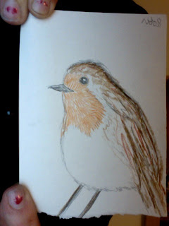
A friend of mine from home asked me to do a few drawings for her Textiles project. It's based to the 7 days of creation. Jess asked me to do the drawing for the fifth day when birds and sea creatures were created.


Monday, 22 March 2010

Printing

Today, Natasha, Anthony and I spent the best part of the day finishing up our zine to be printed. It's all all finished ready in time for Thursday's hand in. I'm so pleased with how it's turned out. Below my 5 final images, the first 3 are the finals that made it into the zine. I felt that these worked best as a group of 3, because although I really like the projected piece, it didn't fit in as well as the others did. I think it's because the colours of the final 3 are more pastel and matte.


Lovelight

I chose a line from a Supremes song that read 'When The Lovelight Starts Shining', and drew it out with a shadow line. I had decided before hand that I wanted to use a light to project this, because although the style of font was overly relevant, I felt that the fact I was using a light to project it fitted well to the title of the song. I scanned this into Photoshop and adjusted my lines to make them a darker black, and also filled in the shadows to make them bold. I photocopied it onto acetate and then used the OHP to project my text onto the wall. I am really pleased with the outcome and I like the fact that the light has a yellow tint to it.


Saturday, 20 March 2010

Completed

These are two of my final images.

I am really pleased with how the 'Buttered Popcorn' image turned out. I had drawn it out in coloured pencil first then scanned it into Photoshop. I really liked how it looked in coloured pencil as it wasn't as harsh as a black line which is what I usually use. I kept everything the same, I just added a block colour background. It worked better with a paler colour because then the drawings didn't get lost.


My original idea for the 'Stop!' image was to have fabric showing through the main cut out words, I thought this would be a good way of portraying The Supremes' glamorous side. Although when I scanned in pieces of fabric, such as silk, it didn't look as nice as I hoped. So instead I used sewing paper, although this didn't look as glamorous I hoped I thought it was quite a good alternative. For the main cut out words I slightly changed each one to what each one to make it more relevant. I'm quite pleased with how this image turned out.

An Interesting Fact About Ferrets

This is just a collage I've made as part of my ABC course in Photoshop.
The type and ferret are all my own.


Friday, 19 March 2010

Talk Time

We had a group evaluation today. There were 4 groups, we all laid out our work and went around commenting on what was successful and what could be changed about everyone's work. It was good to see what everyone else had done and what people thought of your own work. I'm changing part of my popcorn idea after someone said to think about not to use 'The Supremes' in such an obvious way.
I had put out my sequin image, and drafts of my other ideas. My image that's to be stencil cut out, one that I plan to project in a wall, and another in which I plan to have material showing through cut out text. Below are just some drafts or the start of my finals.


(Sorry about the bad quality picture, it's off Photobooth)

Cut Cut

Happy 21st Danny.

Thursday, 18 March 2010

Tough On Stains Poster

I have finally finished the poster for the Tough On Stain project. I am really pleased how it's turned out.
In case you forgot here is the link to their blog!!

http://toughonstains.blogspot.com/

And here is the finished thing!!


Wednesday, 17 March 2010

Happy St. Patricks Day!!

It must rock to be Irish today!!
It's also my friend's birthday today. So Happy Birthday Dale.
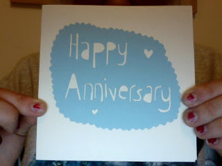
This is his birthday card. I really am enjoying paper cutting recently.


I'm excited because I'm going to be working in the print room today. I have printed in such a long time, so I'm looking forward to it alot. Mono printing all day I think!!
I'll upload some pictures of my print work later.

Tuesday, 16 March 2010

Tough On Stains

A few weeks back a friend of mine asked me to design a website for her Uni project. She studies Arts and Events Management at AUCB and the event they are organising is taking place in a laundrette. It's all about recycling and reusing old clothing. They wanted a simple line drawing of a laundrette, with some chosen text. I am currently designing a poster for them which I'll upload once it's finished.
Below is their blog, which tells you a lot more about the event they are arranging.

http://toughonstains.blogspot.com/

This is the design I gave them. It was only a pen drawing, they then coloured it in how they wanted.


Monday, 15 March 2010

A Good Start To The Day

Today was good. We had a group meeting and have all decided what we're going to do for our 5 ideas, and have, after much discussion, decided how we're going to display our final pieces. Now we're decided the final size, 19cmx19cm, I can start to plan my final pieces.
Natasha and I were just looking through all of The Supremes songs and stumbled across a song called Buttered Popcorn, we were so happy to find a song that's not about love!! I think I'm going to look into using this song as one of my pages.

Sunday, 14 March 2010

Sequin Central

I had this great idea that I make text out of sequins. I thought sequins would be a good way to represent the glamorous clothes that The Supremes used to wear. So I chose one of their famous songs, Baby Love, and wrote the words 'ohh baby love' in sequins. I though it was going to turn out a lot better than it did, I think it ending up looking quite crude and tacky.
I scanned it into Photoshop and had a little play around, but I don't feel that I'm going to get the look that I was aiming for.


Happy Mothers Day!!

Saturday, 13 March 2010

My Favourite Of All The Robs

I previously mentioned Rob Ryan on his window displays, but failed to show quite how beautiful his work is. He has been one of my favourite illustrators for a few years now and is a constant inspiration and I am lucky enough to own one of his necklaces and his beautiful book. Although I could never create anything anywhere near as intricate as what he does, I still want to create a cut out. I've made cut outs before and feel they are an interesting way of portraying type without using a pencil or Photoshop.

My beautiful necklace


Friday, 12 March 2010

London Town Always Inspires Me

I've just got back from London. I went up there for a gig, but on Thursday my best friend and I spent the day wondering around Brick Lane. This is our favourite thing to do when we come to London. We visited the Rough Trade shop and got our photos done in a photo booth they have in store.


I am a bit of a magpie when it comes to leaflets and postcards and will pick up as many things as my hands will allow me to. While in Rough Trade I spied a brown envelope with a beautiful illustration on the cover. After further inspection I found that the artist was Jess Wilson. I have since looked on her website and she is just wonderful. A lot of her work is type based, which is perfect for this current project. Below is some of her work, including a picture of the very envelope which led me to find her. Which was a commission to go on the Entertainist's fortnightly packs.